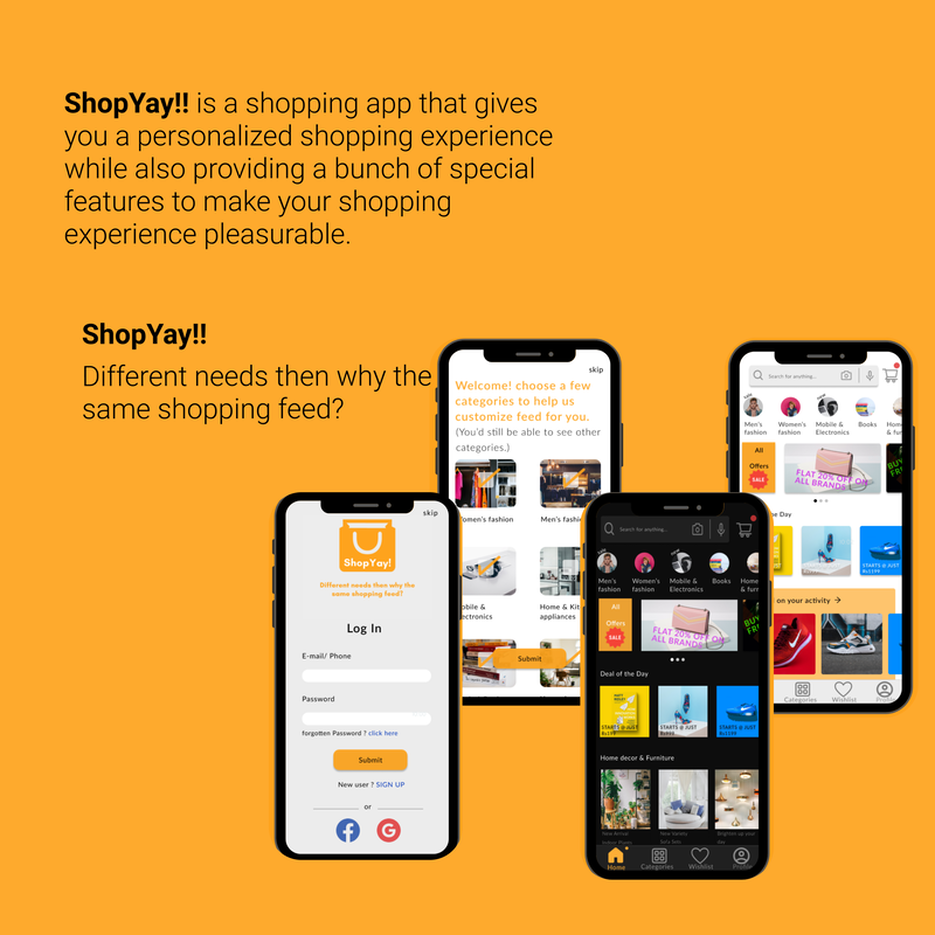
Overview
ShopYay! Is an online shopping app built to optimize a user’s shopping experience by suggesting them products based on their preferences.
This project is a part of a UX Design Challenge.
Being a regular online shopper, I've observed that every online shopping app is missing something in their app's UX , be it an inappropriately placed icons or an absurd overall UI ,that really obstructs the user in efficiently accessing the app. And with technological advancement ,more and more people are relying on e-commerce apps for shopping. According to this report , It’s estimated that there will be 2.14 billion global digital buyers in 2021. That’s about 27.2 percent of the world’s population shopping online, so it becomes vital to have an optimal level of user experience on E-commerce apps.
Role
User Research, UX design, UI design
Team
Solo project
Duration
8 Weeks(Jul’21-Sept’21)
THE PROBLEM
How might I enhance the user's overall online shopping experience ?
|
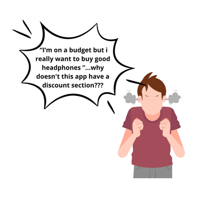
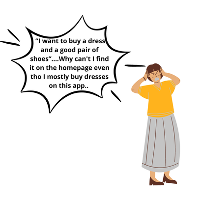
|
With the help of the above two illustrations ,I would like to take you through the struggle of two different people having different requirements yet dealing with the same problem . Inability to find their required items right in the shopping feeds.
Availability of a lot of options right on the shopping feed confuse users and make users exit the app as fast as they enter the app.
Availability of a lot of options right on the shopping feed confuse users and make users exit the app as fast as they enter the app.
THE SOLUTION PROCESS
Research
COMPETITIVE ANALYSIS
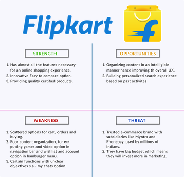
To better understand the problem I conducted a Competitive analysis of two major E-commerce apps . Performing their SWOT analysis helped me find inspiration and identify opportunities to improve.
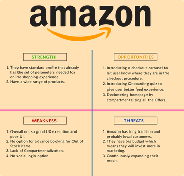
|
|
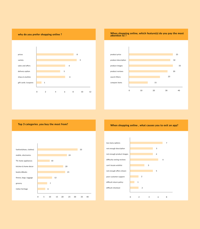
USER SURVEY
Apart from having No personalization, there are a lot of other improvements needed. To identify those areas of improvement , I conducted user surveys to gather information about user’s goals and their pain points while using an E-commerce app. A total of 35 participants participated in the survey . The results of which are shown below-
Insights:
2. When User is shown high pixel images, when the reviews and offers are easily accessible, when the user don't have to browse endlessly to find their required product, then the User chooses to stay and likes to explore the app further.
3. When the user is left with many options to choose from, when options are scattered and when they can't access the their desired product then they tend to lose interest and might even switch to different app that provides a better layout of the data.
- From the survey conducted I got to know that there are mainly 4 categories from which most of the user’s shop . These are-
- Fashion (clothes, shoes, handbags, sunglasses)
- Mobile, computers and electronics
- books/ eBooks
- Kitchen and home decor
2. When User is shown high pixel images, when the reviews and offers are easily accessible, when the user don't have to browse endlessly to find their required product, then the User chooses to stay and likes to explore the app further.
3. When the user is left with many options to choose from, when options are scattered and when they can't access the their desired product then they tend to lose interest and might even switch to different app that provides a better layout of the data.
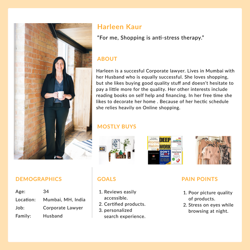
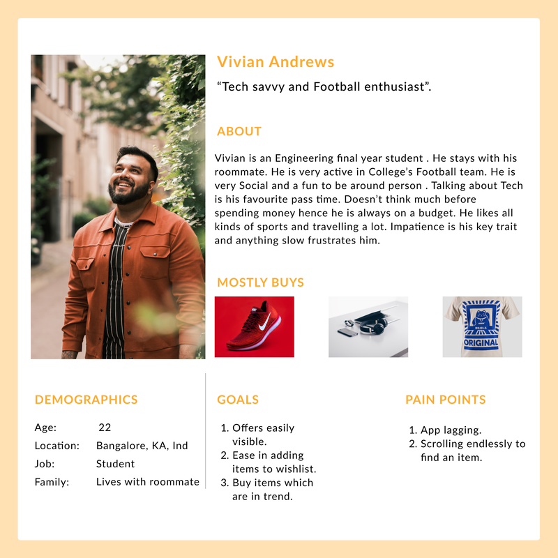
User persona
I consolidated all the data in the form of two personas based on the information gathered. From here onward my design process will revolve around these personas and how can I enhance their online shopping experience.
|
|
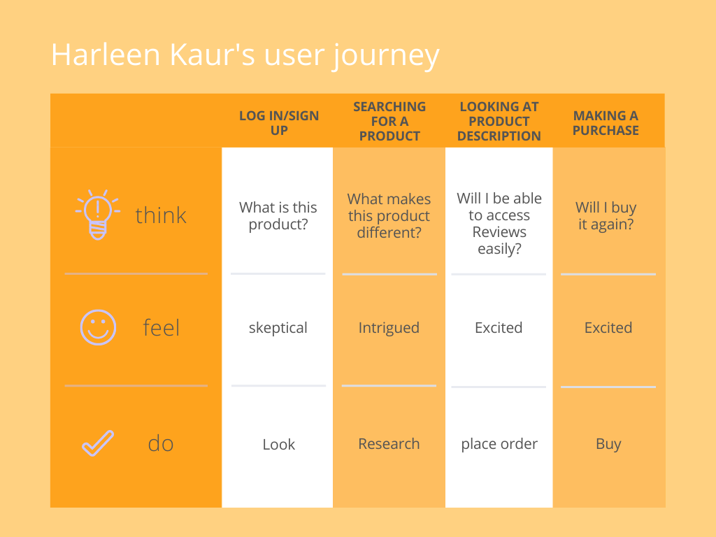
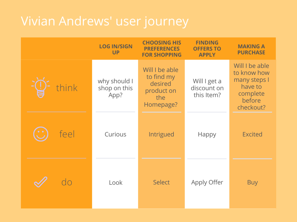
User journey
I tried to map both of these users' journeys and their feelings while engaging with the app to let me know what the high points of satisfaction are and exactly where frustration could possibly occur.
|
|
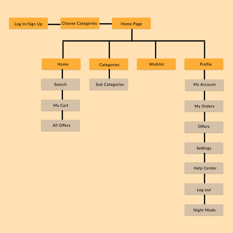
Sitemap
Sitemap helped me organize the structure of the app by grouping information together by their related features to make them more cohesive and memorable.
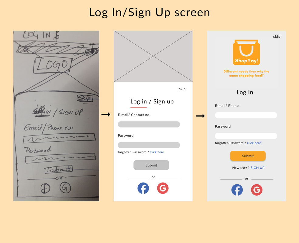
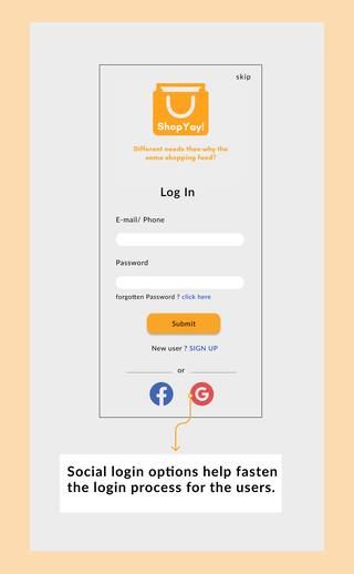
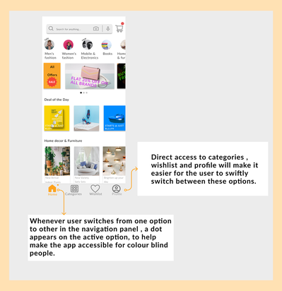
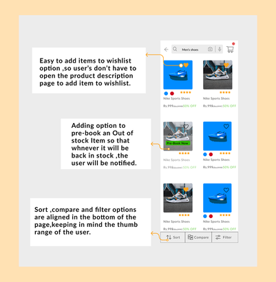
Transitioning from Low Fidelity Wireframes to High Fidelity Designs
Initially I had so many ideas to incorporate in my design. So, I began with paper sketches to get an idea about how my final design should look like.But my final designs look a lot different than the initial sketches simply because I kept iterating my designs. Some of the screens that were changed substantially based on a Usability test are shown below:
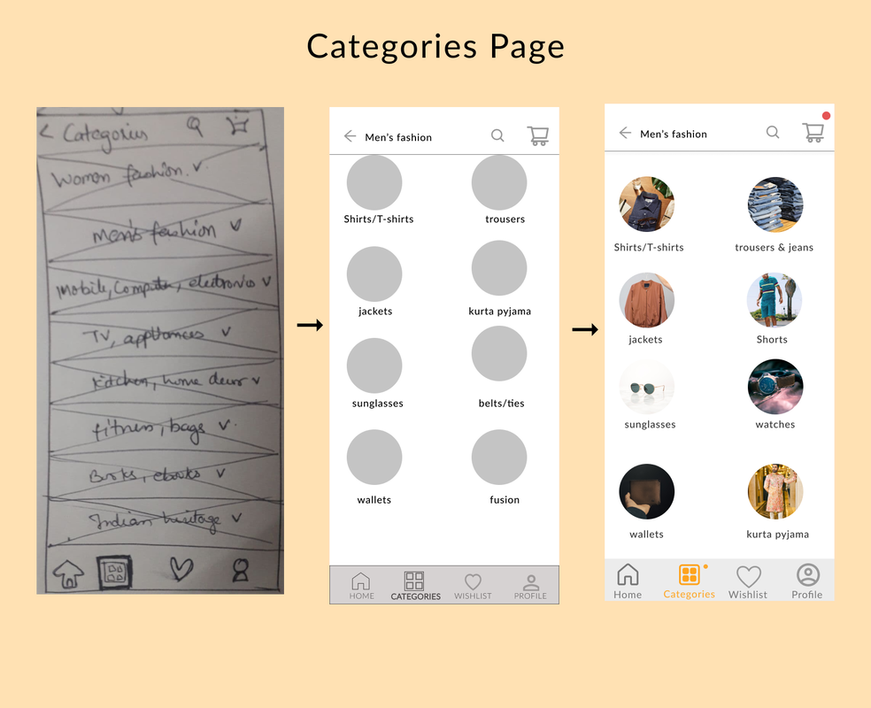
|
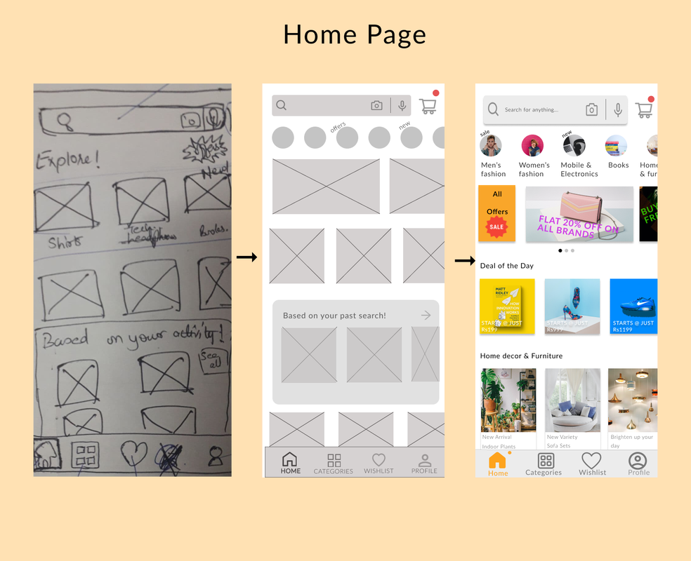
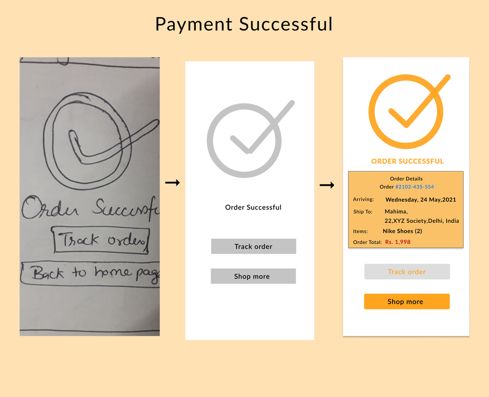
|
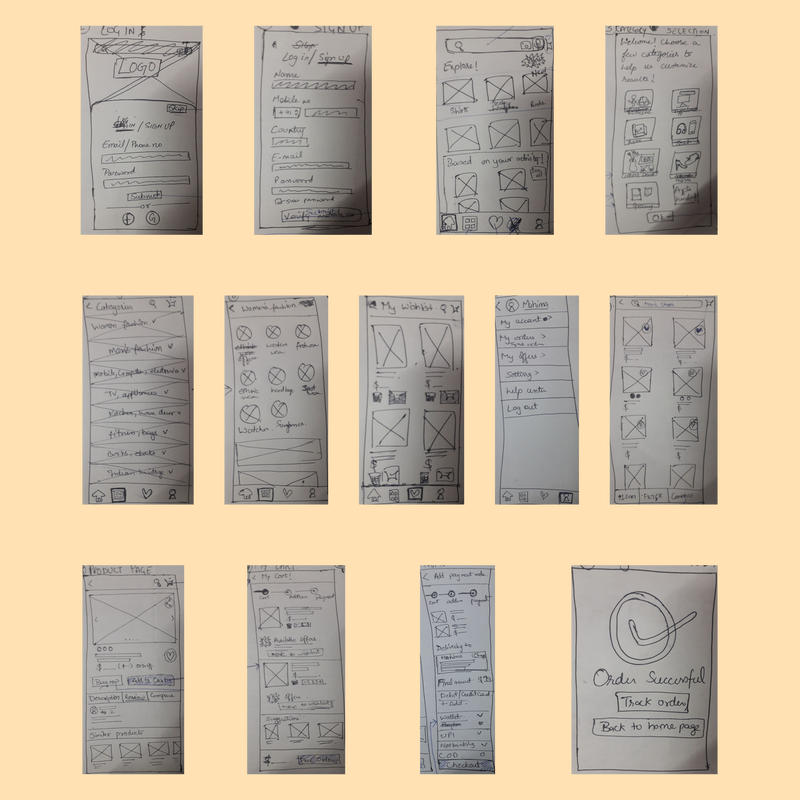
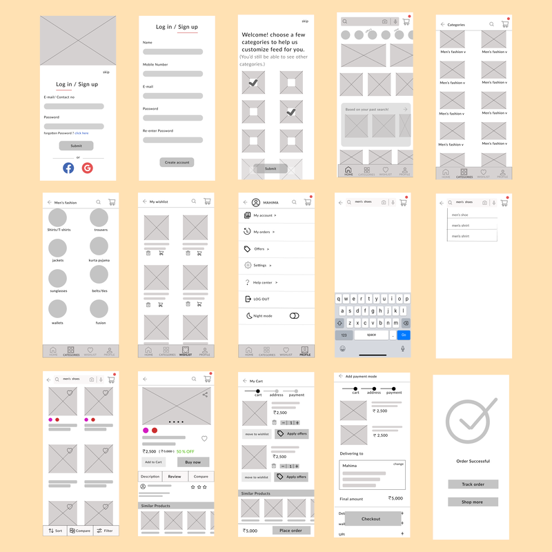
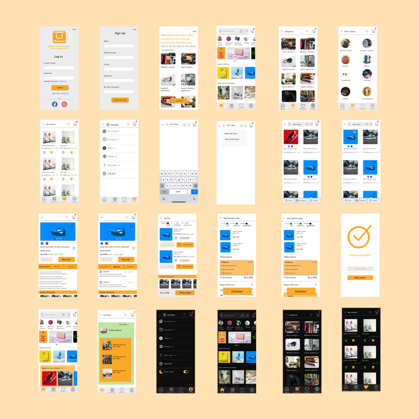
Low Fidelity Wireframes
A set of all the rough sketches that I made taking cues from many sources.
Mid Fidelity Wireframes
Directly jumping from sketches to High fidelity designs would have been a disastrous step because then I would have missed out on some faults in my designs . It was good to create mid fidelity designs so that I could see how my designs would look like and what all needed to be modified in my designs.Below is a set of modified mid fidelity wireframes.
User Feedback
I asked 6 of my friends to perform a few tasks on mid-fidelity wireframes, such as-
1. Sign up on the app and choose categories.
2. Find all offers applicable on Men's fashion.
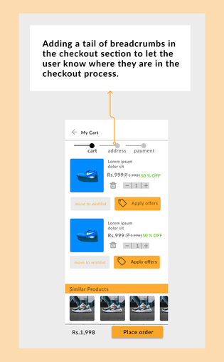
4. Move items from wishlist to cart.
5. Make a payment.
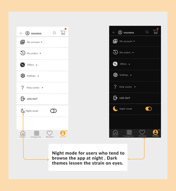
6. Turn on the Night mode.
INSIGHTS-
After performing the test , I observed that they all could swiftly perform all the tasks except for Task 1 and Task 2.
4/6 were visibly uncomfortable in switching from log in to Sign up page .
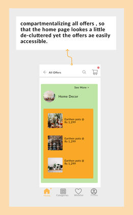
3/6 were expecting for the Offers option to be present on the Homepage while the rest 3/6 thought that it was fine for the All Offers option to be present under the Profile option.
1. Sign up on the app and choose categories.
2. Find all offers applicable on Men's fashion.
4. Move items from wishlist to cart.
5. Make a payment.
6. Turn on the Night mode.
INSIGHTS-
After performing the test , I observed that they all could swiftly perform all the tasks except for Task 1 and Task 2.
4/6 were visibly uncomfortable in switching from log in to Sign up page .
3/6 were expecting for the Offers option to be present on the Homepage while the rest 3/6 thought that it was fine for the All Offers option to be present under the Profile option.
THE RESULT
High Fidelity Wireframes
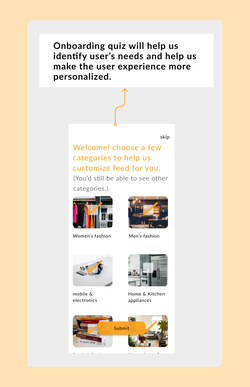
Keeping in mind the user personas and the information gathered from the survey , I tried to add a few innovative features to my app design. Sharing some of the screens below .
|
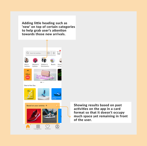

|
Set of final designs is shown below.
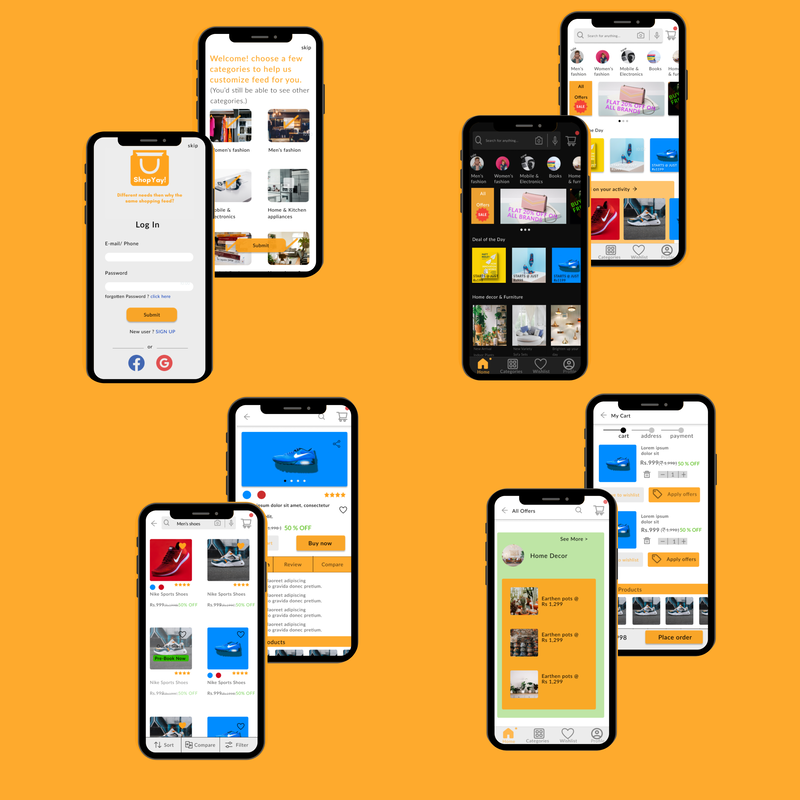
Final Design
Final mock ups give user a simulation of the proposed app. Thus I have added a few mock ups of final design .
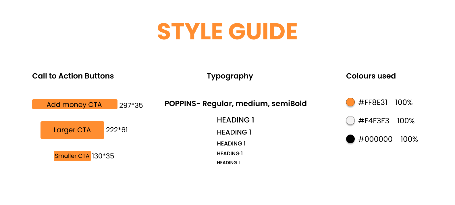
Design guide
Learning
This, being my First ever UX Design case study , is special to me. Ever since I began UX Designing , I knew one of my case studies would be an E-commerce app because I wanted to experience what a UX Designer goes through while designing an app on which half the world relies for shopping.A few key takeaways from my experience so far -
- Iteration is the key ,Pixel perfect designs aren't made over night, they take time. I iterated a lot of things multiple times and I still believe there's room for improvement.
- Don't get too attached to your design, I was reluctant to let go of some of my ideas like that Log in page idea where I tried to make switching between log in and sign up, a little different than the rest of the shopping apps . Turns out not a lot of participants found it to be a comfortable choice . Hence I had to discard that idea.
- Research is inevitable, otherwise we'd never know if what we are designing is what is needed by the people.
